Immerse

Team
Austin Roddick Valerie Gonzaga Ria Thompson Albert Haines Amy Nguyen
Austin Roddick Valerie Gonzaga Ria Thompson Albert Haines Amy Nguyen
Roles
User Researcher UX Designer UI / Visual Designer
User Researcher UX Designer UI / Visual Designer
Duration
10 Weeks
10 Weeks
Background
Context
In the past three months, the COVID-19 pandemic has necessitated massive changes to the way people live. More people are working from home than ever before, and companies are starting to realize that the transition to a remote workforce is entirely possible - perhaps even preferable.
The Problem
Microsoft Teams, Slack, Zoom, and other tools facilitate remote working as we know it today, but when the physical office is cut out completely, a new slew of problems arises. Social interaction becomes rigid and planned. Productivity can fall, and many employees find themselves struggling with their work-life balance.
The Approach
By investigating the way people interact and collaborate remotely, we will be able to understand which aspects of remote work they value and which aspects they despise. Designing thoughtful solutions to these problems can help bring productivity and joy back into the workplace, and lay the groundwork for future innovation.
User Research
My team conducted a series of interviews and observation sessions with ten users. Our stakeholders represented all age demographics and a wide range of professions, and contact with each was maintained through the entire course of the project to allow for iterative testing and validation.
We approached user research with three goals in mind: to investigate our user’s home workspaces, to understand the nuances of remote collaboration, and to experience firsthand how working remotely affects our user’s lives.
Our research data was collected, sorted, and organized into the affinity diagram below. This diagram was one of our most important tools, and was consulted, modified, and rewritten as we acquired new data.
Four ideas stood out among the rest. These major insights guided each design decision we made, and reflect the most significant challenges our users face.
🤝
People need social intimacy to work effectively. This includes both planned socialization and other, unplanned “water-cooler” interactions that arise in a typical workplace.
💻
A clear link is needed between physical and digital workspaces. Users new to remote working expect their new tools, offices and workflows to mirror those made possible by a physical office.
🎨
It’s important for people to be able to customize their environment. Self-expression promotes individualism and helps users feel more comfortable in their workplace.
🧠
Our users need a better way to learn remote working technologies. Current solutions are adequate for tech-savvy individuals, but for folks unfamiliar with tech, adapting can be a confusing process.
Storyboarding
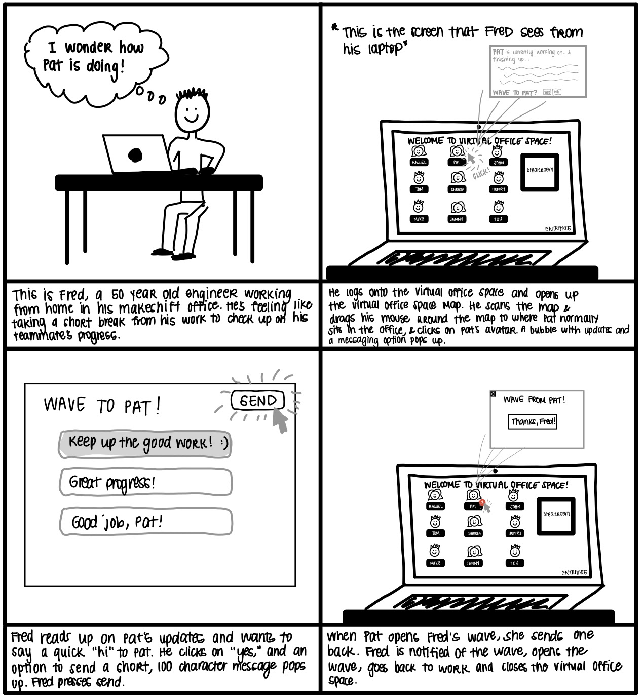
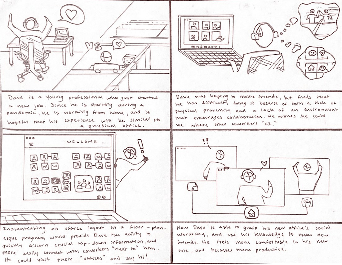
To better empathize with our users and structure our brainstorming sessions, we developed several storyboards and user personas. These storyboards attempt to address two of our major insights: social intimacy and physical-digital workspace continuity. Our learning and customization insights are broad, and apply to many facets of the other two; as such, we chose to not have them stand on their own.
Storyboards
Virtual Office Space
If we construct a floorplan-esque interface to recreate the physical office, users might feel more immersed in their work. This approach would provide a much more dynamic approach to remote working than many existing tools, but might not allow us to provide the level of feature-rich communication that we were looking for.
If we construct a floorplan-esque interface to recreate the physical office, users might feel more immersed in their work. This approach would provide a much more dynamic approach to remote working than many existing tools, but might not allow us to provide the level of feature-rich communication that we were looking for.
Positive Social Interaction
Allowing users to send positive messages to coworkers could improve motivation and make the workplace feel more friendly. While this tool would be a useful addition to a digital workspace, it doesn’t quite provide enough features to satisfy the requirements of our learning or customization insights.
Allowing users to send positive messages to coworkers could improve motivation and make the workplace feel more friendly. While this tool would be a useful addition to a digital workspace, it doesn’t quite provide enough features to satisfy the requirements of our learning or customization insights.
We decided to move forward with the virtual office space concept. It was a simple, novel, and malleable idea that was specific enough to address our major insights yet general enough to allow for the integration of any feature we might think of in the future.
Prototyping
⚠️
Working on this project during quarantine meant that all of our interactions with stakeholders had to be remote. This made testing with a paper prototype difficult, but not impossible. It also made collaborating with my team more difficult, because we were unable to meet in person.
We tackled these issues a few different ways:
✔️
We moved toward digital prototyping at an earlier stage than usual.
✔️
We met for extended periods of time when working on early ideation and prototyping.
✔️
We tested the paper prototype with our users through video walkthroughs and talkthroughs.
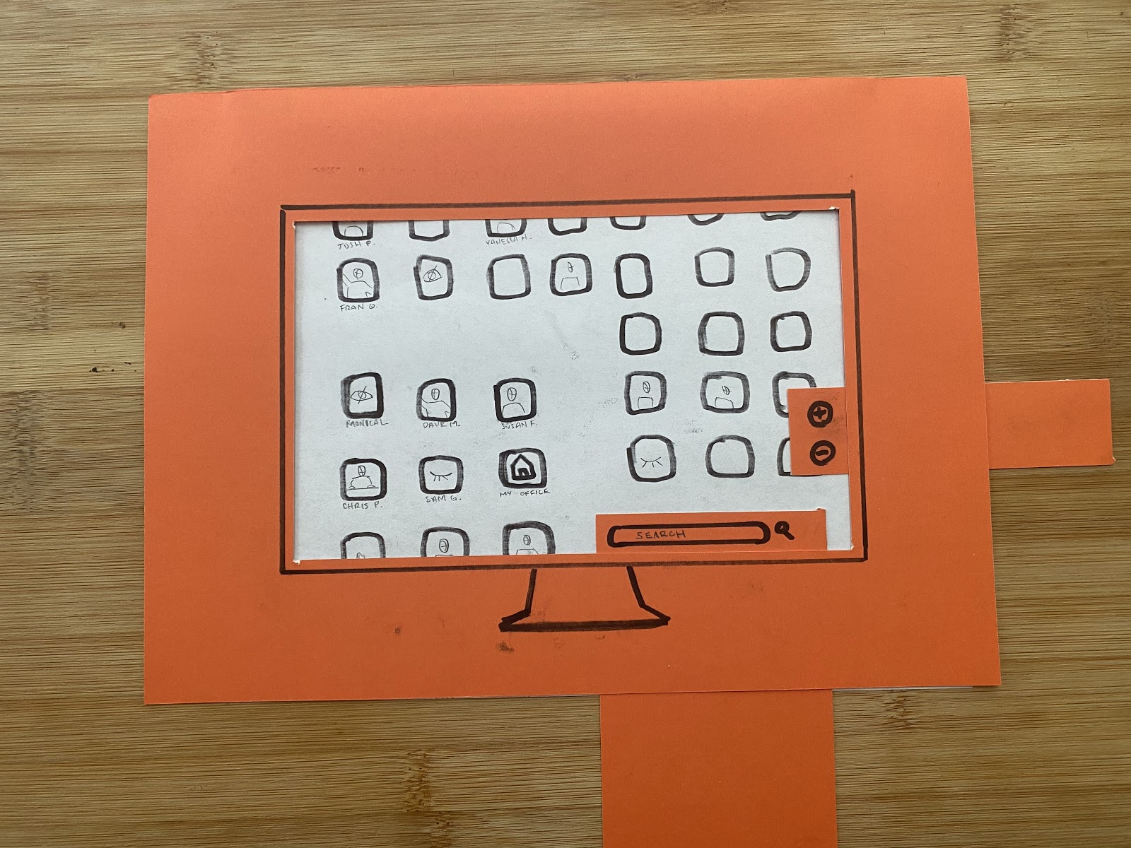
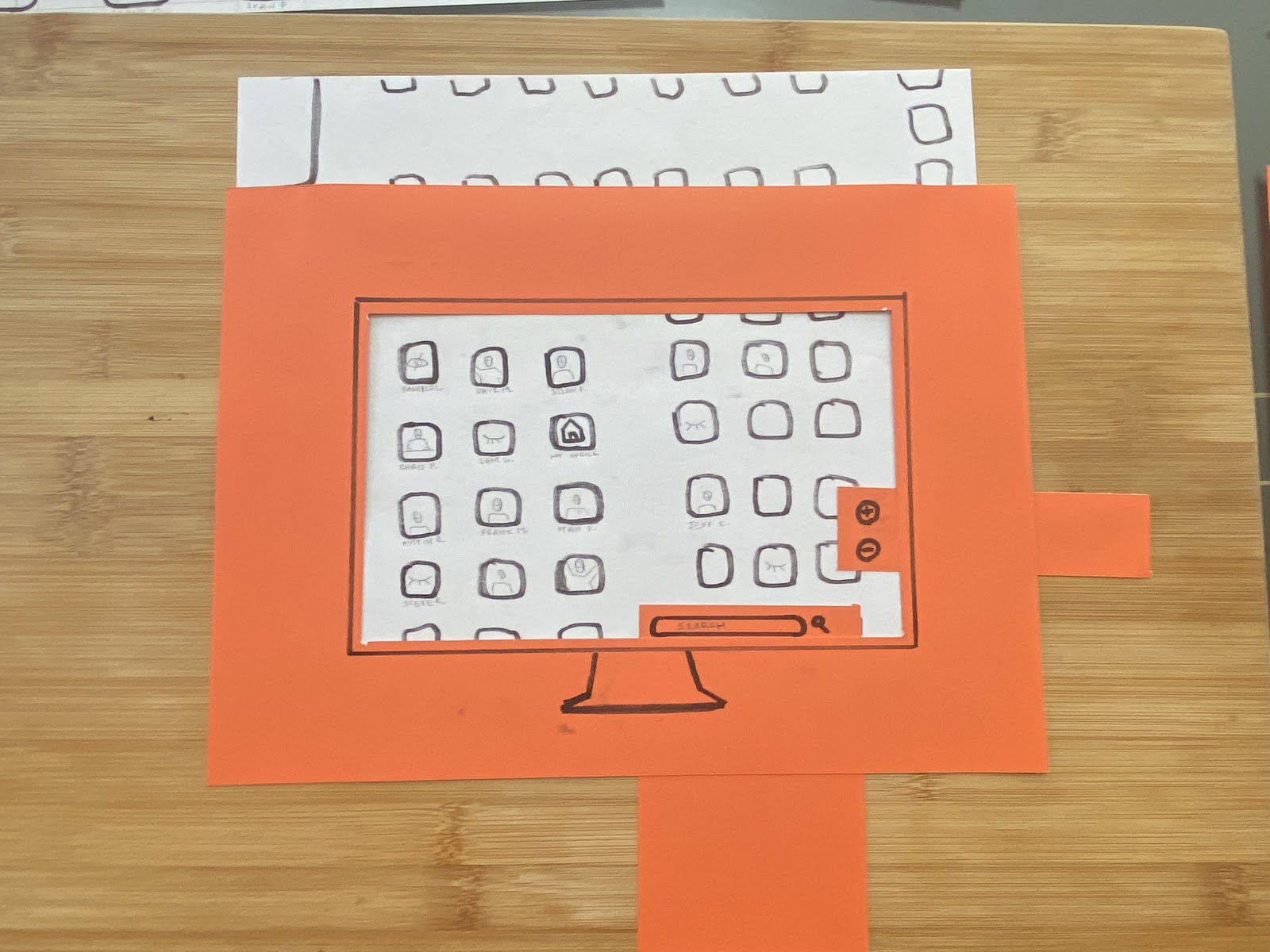
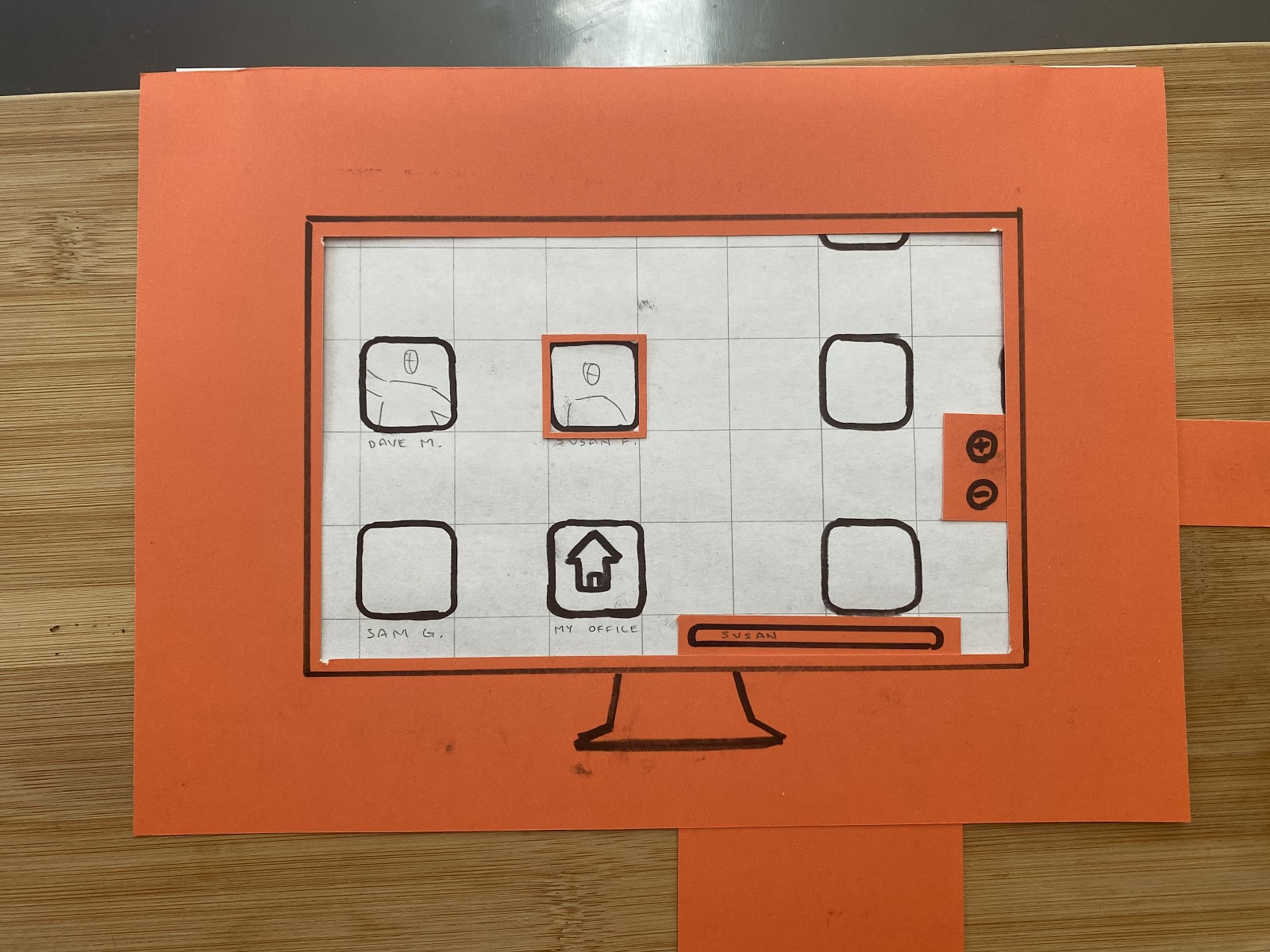
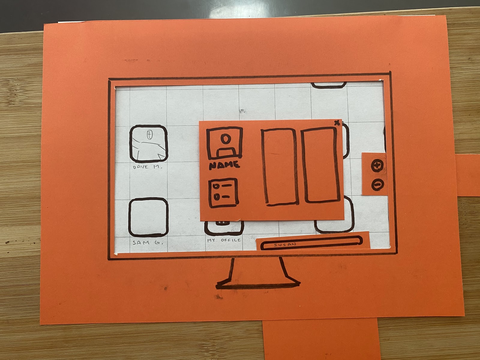
The paper prototype is shown below. We conceptualized a Google Maps-like scheme for navigating the “virtual office” we wanted to create, and this early model let us validate the concept with our stakeholders.
Concept validation was a resounding success, and we began to work towards higher fidelity prototypes of this model.
Concept validation was a resounding success, and we began to work towards higher fidelity prototypes of this model.
Wireframing
After drafting a few different wireframes, we decided to split our application’s functionality into two “views”: Home View and Dynamic View.
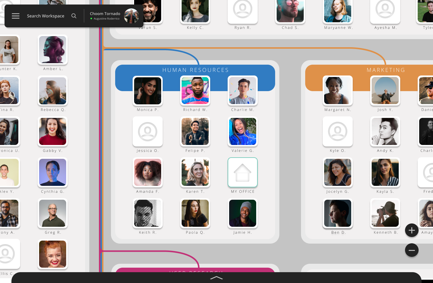
Home View is the main screen of the program. It holds the map-style office interface and acts as a home base for users to return to.
Dynamic View was our approach to communication visualization. Meetings, conversations, and messages sent between employees are visualized here in real time as small clusters.
Dynamic View is our response to the lack of social interaction experienced by our stakeholders during quarantine. Many confided that they missed both seeing and participating in random hallway or lunchtime conversations, so we decided to try to emphasize these small interactions by dynamically grouping users who are currently in meetings or having discussions. We placed this feature into a separate “view”, accessed by a large toggle button in the corner.
While our initial idea was to only use Home View, it alone does not allow a user to visualize how employees and teams are directly connected.
More specific information about this initial wireframe is detailed below.
While our initial idea was to only use Home View, it alone does not allow a user to visualize how employees and teams are directly connected.
More specific information about this initial wireframe is detailed below.

Overview of User Testing
Timeframe:
Users:
User Jobs:
Methods:
Users:
User Jobs:
Methods:
4 weeks
10 users, retained weekly - a within-groups design
Healthcare, software, UX, finance, event planning
Interviews, prototype walkthroughs, observation sessions, contextual inquiry
10 users, retained weekly - a within-groups design
Healthcare, software, UX, finance, event planning
Interviews, prototype walkthroughs, observation sessions, contextual inquiry
Iteration 1: Rethinking Dynamic View
We assembled our rough wireframes and put them in front of users for a primary round of user testing. These initial user tests had three components: a prototype walkthrough, a contextual “office space” walkthrough, and an interview. Our goal at this stage was to validate our design concept, and make adjustments as necessary.


Key Findings From Testing
Participants did not understand the point of dynamic view. This could be due to the fact that the prototype was very simple at this stage, and there were very few visual indicators of main features.
Privacy was an immediate concern for our users. While they liked the idea of visualizing nearby social interaction, they felt that it would be important to at least be able to opt out of this feature.
Our Response
We completely removed “Dynamic View” and replaced it with “Meeting View”, putting more of the focus on letting our users host and attend specific meetings. This would also be more understandable and familiar to our users, and fit well with the ease of learning insight.
Visualizing meetings and meeting attendance at a high level may be more useful for users than random social visualizations, as they can see a summary of company activity. This fits the social intimacy insight.
Additionally, these changes address privacy concerns by narrowing the scope of visualizations that an individual can appear in.
Iteration 2: Complete Restructure
In the next testing iteration, we presented users with a low-to-mid fidelity prototype that focused on the “split view” structure we had created. Our methods this week included user testing with a prototype and friction interviews.
Friction interviews explored the idea of designing for friction, an interesting concept that we wanted to work into our design process. We focused our interviews on our users’ feelings and desires related to their work and how they might have changed with the onset of COVID, with the goal of identifying creative ways to introduce friction into our product.
 Low-Fidelity Meeting View
Key Findings From Testing
We made some incorrect assumptions. Many of our users either didn’t understand the purpose of Dynamic/Meeting View, or couldn’t think of a reason why they would want to see that information. Several of our users flat-out told us that they didn’t care about seeing this information.
OUR ASSUMPTION: People who are newly working from home miss the dynamic, spontaneous social interactions that arise in a physical workplace, and getting these interactions back would improve their work-related wellbeing.
Our Response
After much ideation, we decided to drastically adjust the structure of our product.
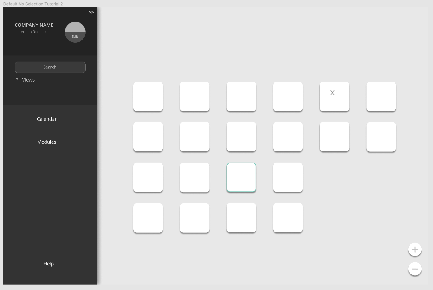
We changed the name of Static View to Office View.
We completely retooled Meeting View, keeping and integrating certain key features into Office View. We kept the visualization of ongoing meetings and available meetings. We removed the “dynamic” part of Meeting View, and implemented a more rigid information architecture that makes it easier to find and save meetings.
Why did we make these changes? Well, our users wanted a stronger focus on meetings, and wanted a more familiar layout in the Meetings page. This fits the physical-digital link insight, as this new Meeting View structure better fits users’ existing mental models and provides a smoother transition for those coming from tools like Zoom or Teams.
 Low-Mid Fidelity Office View
 Low-Mid Fidelity Meeting View
Users had further recommendations for the “My Office” page and the types of widgets we could create for it. The My Office page would now be module-based, and the modules will be easy to add, move, and remove. Users will also be able to customize the color and styling of their personal office page. This fits the customization insight.
Iteration 3: Final Changes
For our last round of testing, we tested users with a high-fidelity prototype over the course of two weeks. Users were tested each week, with adjustments made to the prototype in between weeks. The goal of this final round was to get feedback on the near-finalized prototype, and specifically get feedback on Meeting View and the My Office page.

Key Findings From Testing
Office View layout was seen as very dynamic and fresh, while Meeting View was seen as more traditional and fixed. This led some users to feel that Meeting View takes some of the focus away from Office View, which they felts should be the primary screen.
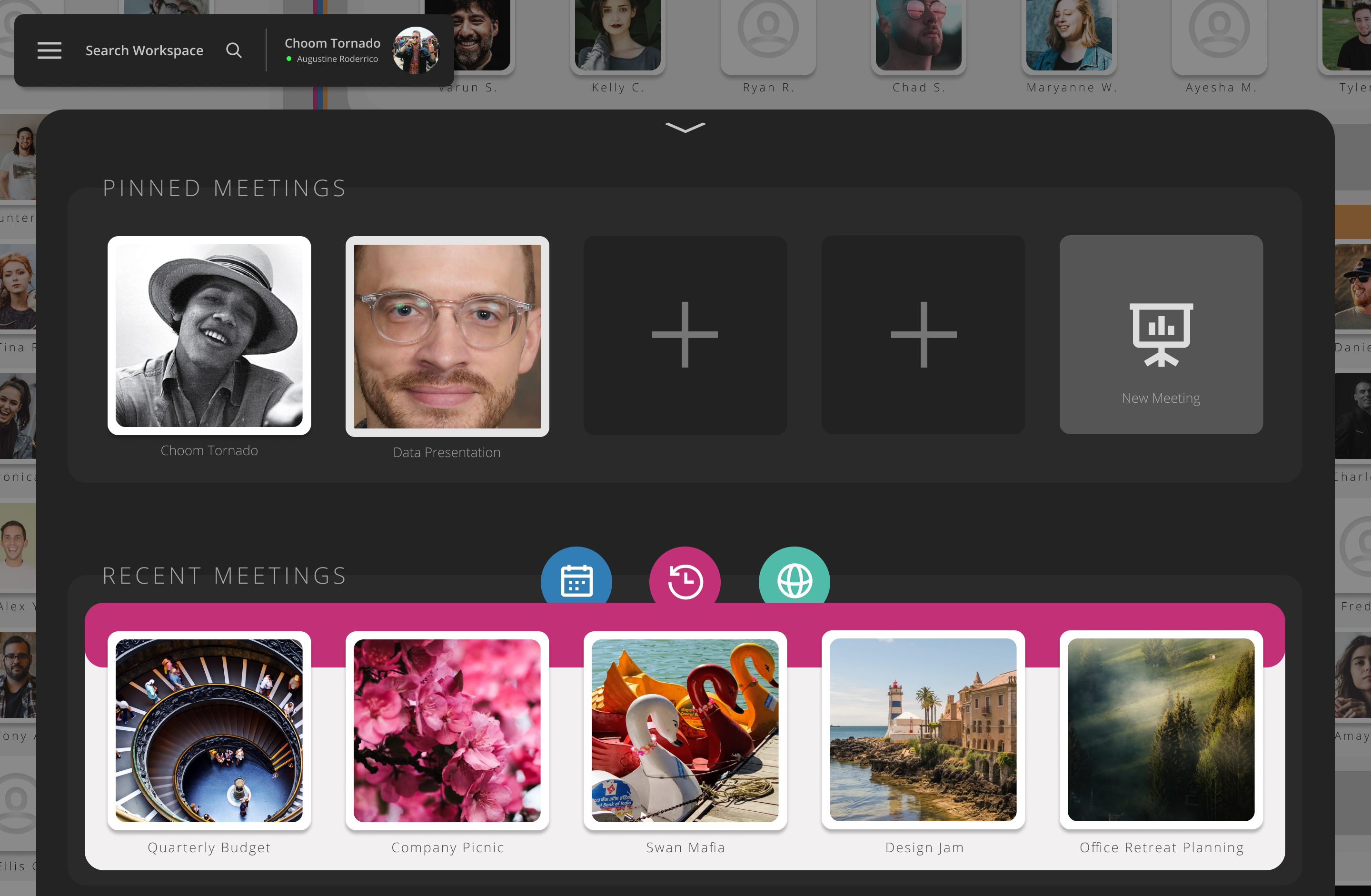
Users wanted to be able to pin meetings to the top of Meeting View.
My Office needs more thoughtful and creative widgets.
Our Response
We moved Meeting View to a pullout tab. This puts most of the focus of users on the Office View page, as Meeting View is now a layer that can be superimposed on Office View instead of a separate page. Our users liked this format more.
We added a Pinned and Recent Meetings section to the top of Meeting View.
We added and streamlined existing widgets on the My Office page, as well as a shortcut Call and Message button.
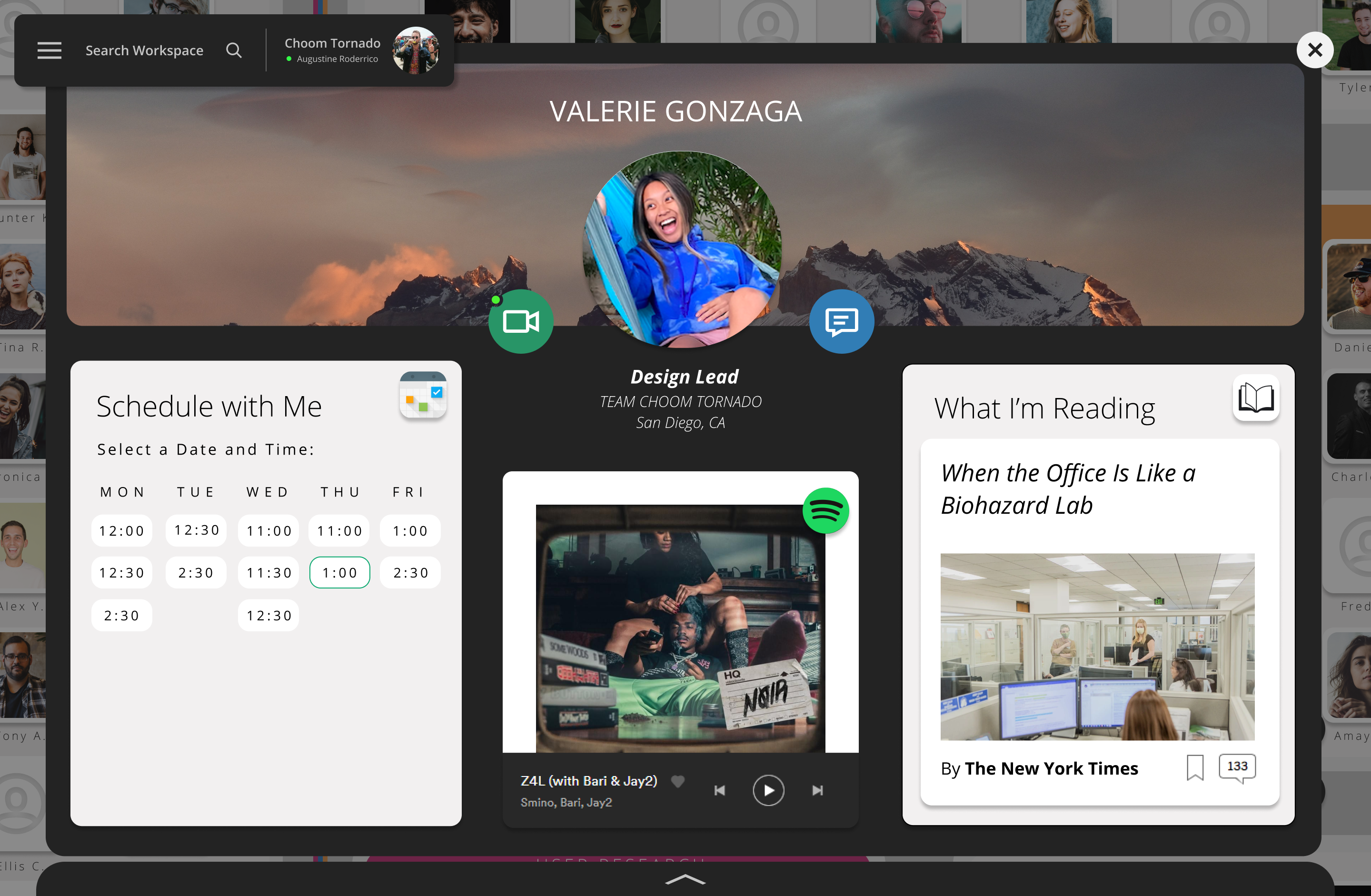 My Office view
Final Design
Our final design incorporates insight from ~5 weeks of iterative testing and ideation. Below you will find an interactive prototype of our final design and an overview of certain key features.
Reflection
At first, the prospect of working on a complex project such as this during quarantine seemed terrifying. How were we supposed to conduct our user research and testing? How would I be able to truly validate our concepts with stakeholders if I could only share with them the contents of my computer screen? I fought with these doubts constantly.
Tackling Adversity
I eventually realized that the true value of this work was not simply in the work itself - it was in the process of proving that useful contextual design doesn’t have to be limited by circumstance. In fact, strange or difficult circumstances are often more of a reason to engage in projects like this one. Challenging convention in times of crisis is necessary for innovation.
Taking It Further
If I could continue work on this project with more time and resources, I would begin by conducting user research specifically on how different populations interact with each other through video communication technology, perhaps by watching groups of people work together. Understanding the quirks and conventions that influence live collaboration in a digital workplace could help us streamline the UX of the office and meeting views.
❤️
The idea of Immerse would not exist today without my amazing teammates. Their hard work, dedication, and creativity helped turn a dream into a reality.
