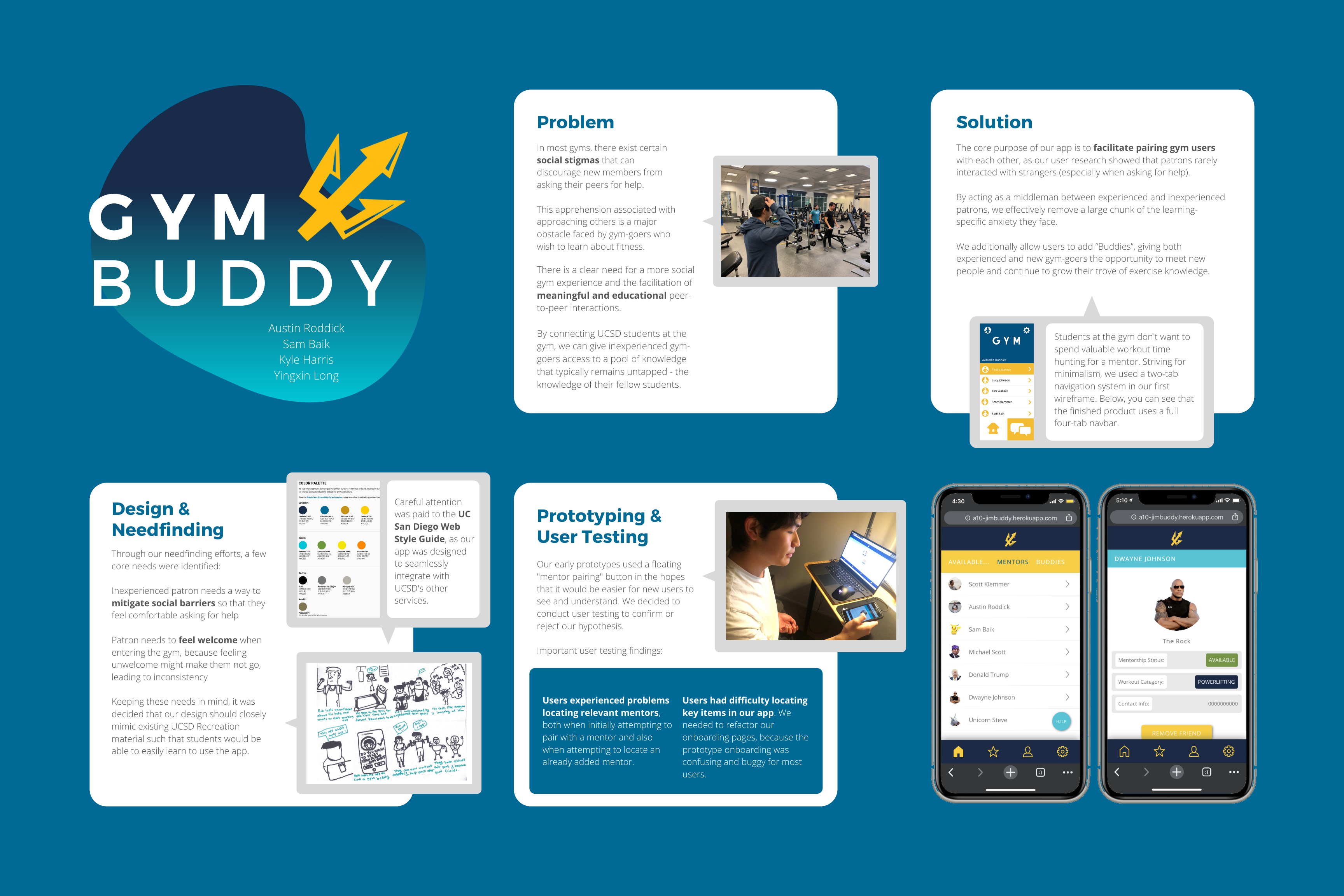
GymBuddy

Team
Austin Roddick
Sam Baik
Kyle Harris
Yingxin Long
Austin Roddick
Sam Baik
Kyle Harris
Yingxin Long
Roles
User Researcher UX Designer UI / Visual Designer Full Stack Developer
User Researcher UX Designer UI / Visual Designer Full Stack Developer
Duration
10 weeks
10 weeks
Background /
You’re probably familiar with the discomfort that can come from trying to get back in to a workout routine. It’s awfully easy to fall into the trap of comparing yourself to other people. See that ripped guy across the gym? His muscles are practically staring at you. Just play it safe and assume that he doesn’t want to talk to you. After all, he seems really focused on his own workout.
The front desk staff at many gyms are trained to guide new patrons and give advice, but they are often busy and can be unqualified to hand out fitness-specific information. Educational materials on display in gyms are sparse at best. And when you ask for workout recommendations? You’ll get them, for the low price of $49.99 per session.
Gym knowledge is often shared tribally, passed from one patron to another. Finding ways to allow newcomers to tap into this knowledge could be lucrative. By investigating ways to increase peer-to-peer interactivity in a gym setting, the experience of using the gym can be improved; gym education can be streamlined in a way that is more friendly to newer, less knowledgeable workout enthusiasts.
User Research /
At this stage, our main goal was to observe a wide range of students as they exercise at the gym, and attempt to understand their goals, feelings, desires, and frustrations. Over the course of several hours spread across three days, my team identified the salient needs of students, employees, and managerial staff at RIMAC, UC San Diego’s largest gym complex. Some of the most interesting finds are detailed below.
- Inexperienced patron needs a way to mitigate social barriers so that they will feel comfortable asking for help
- Inexperienced patron needs to feel welcome entering the gym, like they are part of a community, because feeling unwelcome leads to inconsistency
- Veteran patron needs a platform for learning at a higher level, because it is more difficult to find information when you reach near-competitive levels of powerlifting
- Gym staff needs a way to connect more personally with patrons, because many gym staff feel useless when patrons do not ask for help
Storyboarding /
Two major storylines arose from our data. We created a storyboard for each to better visualize the themes they present, and to create a tangible reference for future ideation. The storyboards can be seen below - you can use the arrows to switch between images.
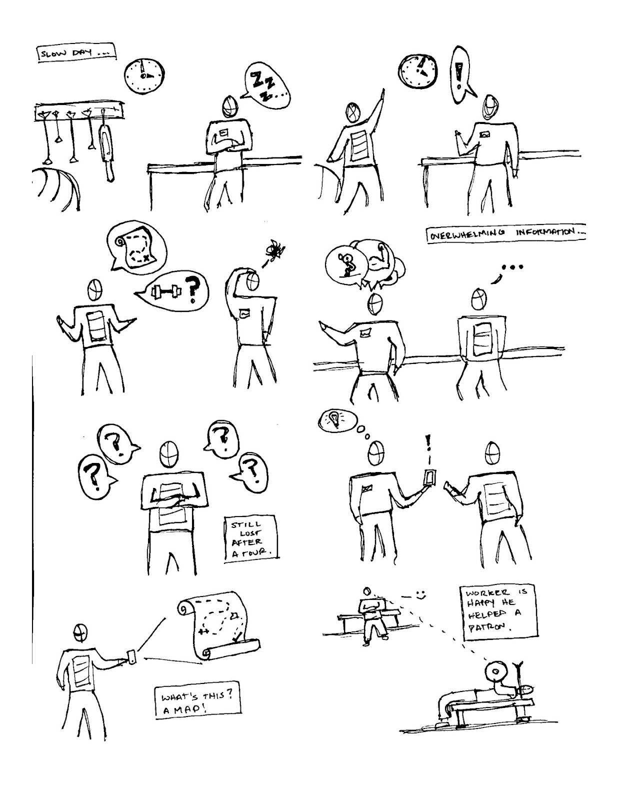

Social Connection
This storyboard illustrates how a person’s gym experience is connected to self-image, describing a social network-like tool that would allow students to find gym mentors without unneeded friction.
This storyboard illustrates how a person’s gym experience is connected to self-image, describing a social network-like tool that would allow students to find gym mentors without unneeded friction.
Map the Gym
Giving our users a customizable map of the campus gym would reduce confusion and make gym learning much smoother. Unfortunately, this solution doesn’t address social problems.
Giving our users a customizable map of the campus gym would reduce confusion and make gym learning much smoother. Unfortunately, this solution doesn’t address social problems.
Paper Prototyping /
Next we built a map-like prototype (drawn by yours truly) reflecting the “Map the Gym” storyboard, and a social network-esque prototype reflecting our “Social Connection” storyboard. The map prototype focused more on the user’s need for better direct education, while the social connection prototype aimed to facilitate meaningful interactions.


Social Connection
Testers were able to easily navigate the app, but felt that the app needed a calendar system so that one would be able to see a friend or mentor’s schedule and plan to attend the gym accordingly. Additionally, testers felt that there needed to be a clearer manner of differentiating between “friends” and “mentors.”
Testers were able to easily navigate the app, but felt that the app needed a calendar system so that one would be able to see a friend or mentor’s schedule and plan to attend the gym accordingly. Additionally, testers felt that there needed to be a clearer manner of differentiating between “friends” and “mentors.”
Map the Gym
The heuristic analyses of this prototype pointed towards a general confusion regarding layout. Students presented with the physical prototype often misclicked, and felt confused at the exact nature of the information they were being presented. Most did not understand what the “QR Code” button was used for.
The heuristic analyses of this prototype pointed towards a general confusion regarding layout. Students presented with the physical prototype often misclicked, and felt confused at the exact nature of the information they were being presented. Most did not understand what the “QR Code” button was used for.
As a result of paper prototype testing, we decided to focus our efforts on the social connection model. We received overall better feedback on this prototype, and decided to scope ourselves accordingly.
Wireframing /
Moving forward with our social connection model, we created wireframes loosely modelled after social networks like Facebook and Twitter. This layout is familiar and intuitive, ideal for an app being used at the gym. Patrons would not want to be distracted from exercise for very long.
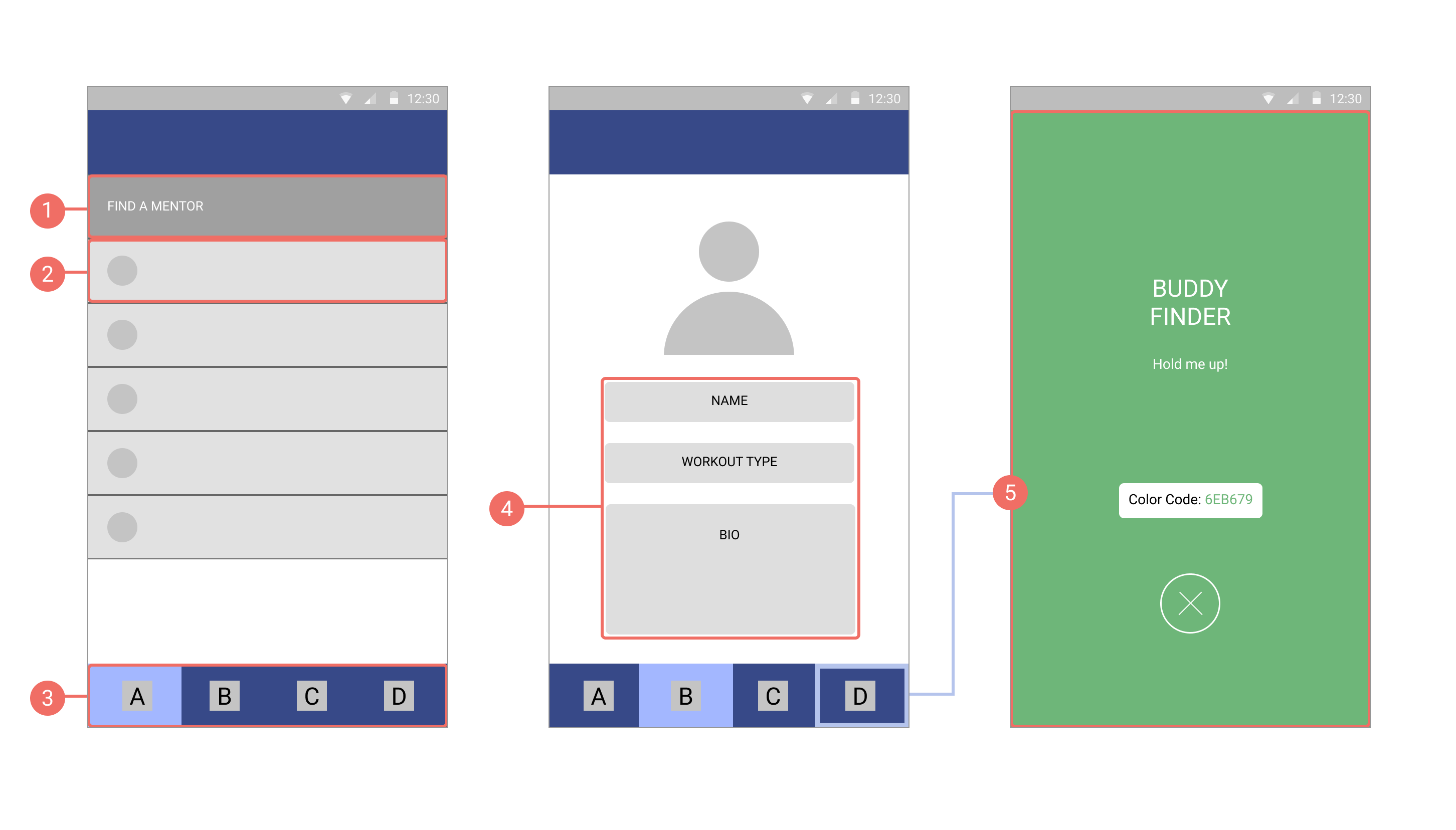
1 Find a Mentor
Clicking this button allows a user to quickly match themselves with a random mentor.
2 Available Buddies
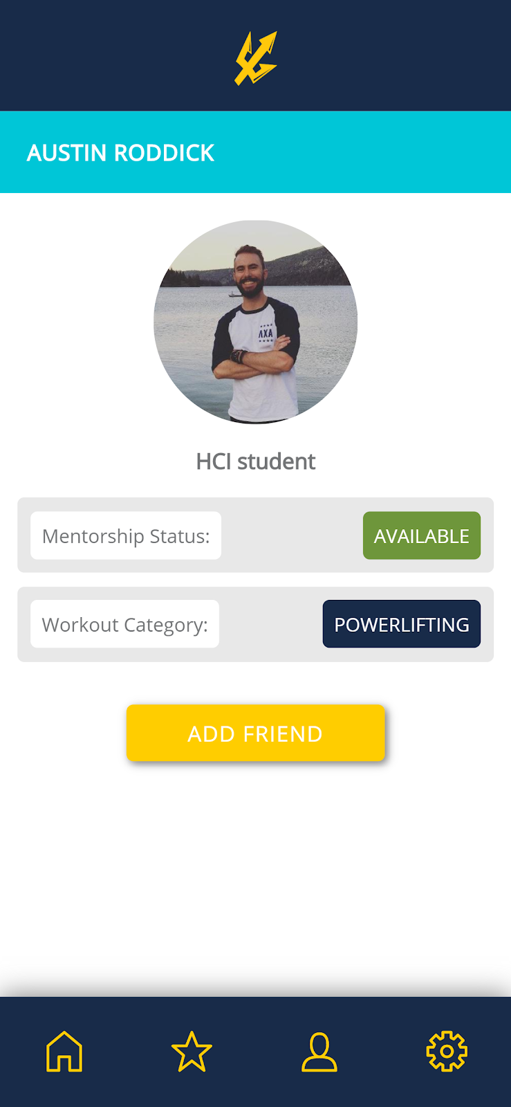
Below the mentor matching button, available buddies will be listed. Clicking on a name will take the user to that person’s profile page, where they can be added as a friend.
Clicking this button allows a user to quickly match themselves with a random mentor.
2 Available Buddies
Below the mentor matching button, available buddies will be listed. Clicking on a name will take the user to that person’s profile page, where they can be added as a friend.
3 Tab Navigation
All features of the app are accessible through a set of navigation tabs at the bottom of the screen. The bar is persistent; this way, the app is clearly structured and easy to use.
4 Profile Page
Here a user can edit their profile and personal information. Including a workout type lets users find a mentor that uses similar exercises.
5 Buddy Finder
Are you familiar with Lyft’s driver locating feature? Both a rider and their driver are presented with a uniquely colored splash screen, and if the rider holds their phone in the air, the driver can quickly locate them. Similarly, this feature will help new mentor-mentee pairs find each other quickly when they meet for the first time.
Are you familiar with Lyft’s driver locating feature? Both a rider and their driver are presented with a uniquely colored splash screen, and if the rider holds their phone in the air, the driver can quickly locate them. Similarly, this feature will help new mentor-mentee pairs find each other quickly when they meet for the first time.
User Testing /
After constructing a Wizard-of-Oz prototype using Javascript, jQuery, and Node.js, and hosting the app on Heroku, we decided to conduct user testing to validate certain UI/UX pain points like ease of navigation, speed and overall satisfaction of mentor pairing, and to check for other features our stakeholders might like us to add.
Mentor Pairing
![Left to Right: Initial homepage, pressing the "Pair" button, adjusted homepage]() Left to Right: Initial homepage, pressing the “Pair” button, adjusted homepage
Left to Right: Initial homepage, pressing the “Pair” button, adjusted homepage
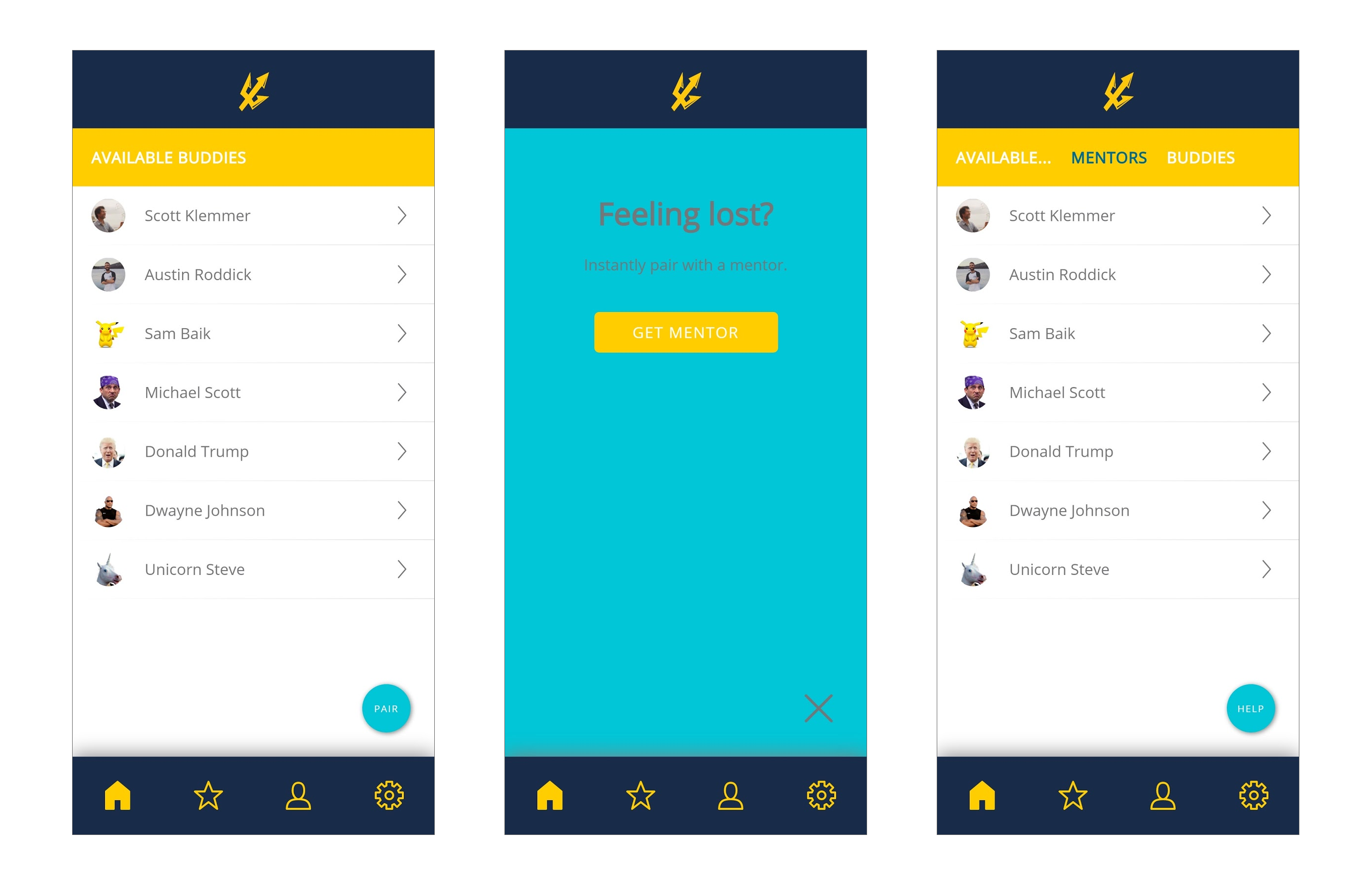 Left to Right: Initial homepage, pressing the “Pair” button, adjusted homepage
Originally, we housed the mentor pairing functionality in a large, colored button in the bottom right corner of the screen. Since it was our defining feature, we hypothesized that the button’s size and proximity to the thumb would result in the best overall user experience. Many stakeholders confided with us during user testing that they felt the button was unnecessary.
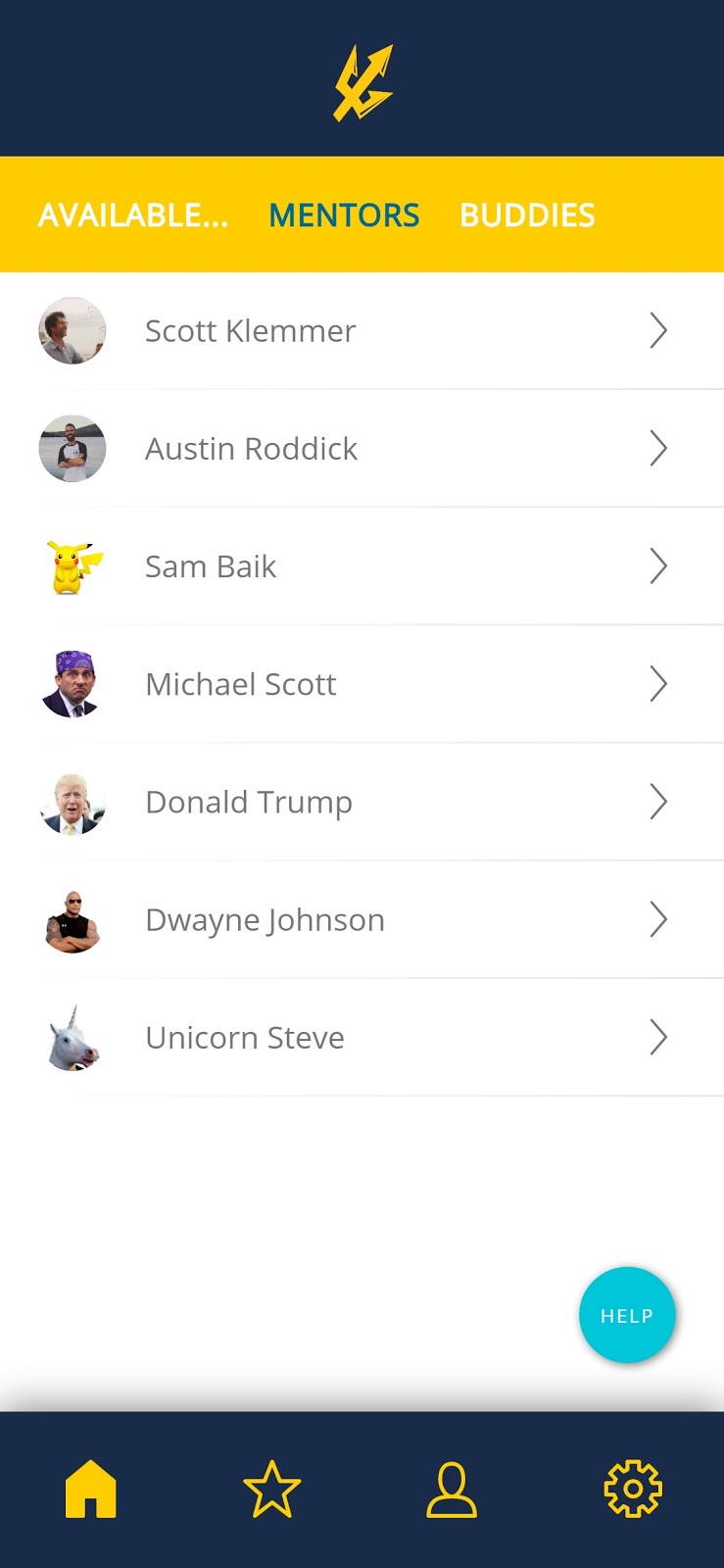
To test their claims, we set up an A/B test with an alternative to the button - a filter on the homepage that would allow one to sort between available “Buddies” and available “Mentors” on the same page, with the click of a button. Our Analytics experiment proved that with the filter version (”After” image above), users were able to add, remove, and view potential mentors an order of magnitude faster than before. Users also expressed that they liked the ability to choose a mentor, rather than having the mentor assigned to them randomly.
To test their claims, we set up an A/B test with an alternative to the button - a filter on the homepage that would allow one to sort between available “Buddies” and available “Mentors” on the same page, with the click of a button. Our Analytics experiment proved that with the filter version (”After” image above), users were able to add, remove, and view potential mentors an order of magnitude faster than before. Users also expressed that they liked the ability to choose a mentor, rather than having the mentor assigned to them randomly.
Final Design /
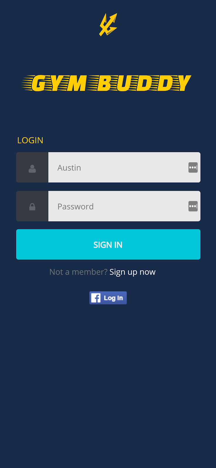
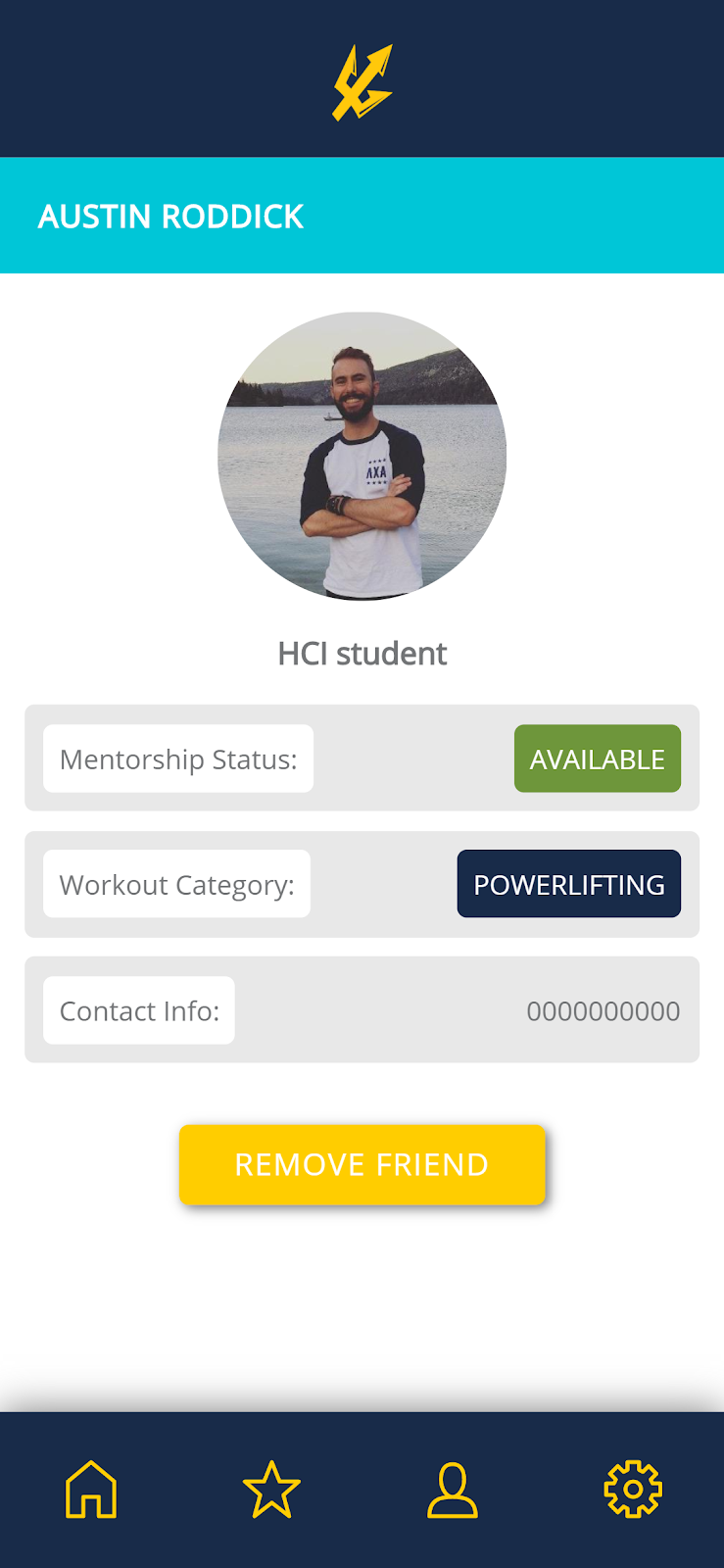
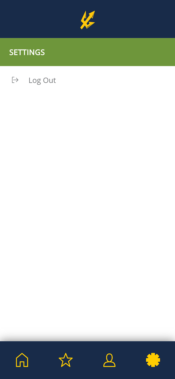
Due to time constraints, the Lyft-style colored mentor locator did not make it into our final design. The rest of the application was finished based on the feedback we received from user testing and research, as well as our initial wireframes.
Careful attention was given to the color scheme - we closely followed the official UC San Diego color palette, as our application caters specifically to UCSD recreation facilities.


Reflection /
Before I formed my team and began work on this project, I worked for UCSD recreation and staffed the various weight rooms on campus. I have a passion for fitness and helping others, so when I was presented with an opportunity to more deeply investigate the gym’s social environment, I jumped on it with enthusiasm.
Speaking truthfully, this project was difficult. It was my first major design project; my team and I faced our own internal challenges, and on top of the design work, we had to learn all of the front- and back-end tools needed to build the app from the ground up. I found myself working to keep my team accountable to deadlines and deliverables. I learned how to manage my own time more efficiently, and how to effectively settle disputes among teammates.
If I could tackle this project again with more time and more resources, I would pour much more energy into multiple iterations of needfinding, product validation, and user testing. Time and skill constraints led us down a fairly linear design path, so I would love the opportunity to make the path concentric. Making an Affinity Diagram would have been incredibly useful - if we had a huge pool of initial ideas to work with, we may have been able to design something much more special.
This project was my first encounter with the human-centered design process - the first of many. I will use what I learned from these challenges to tackle future projects, and frankly, I hope they are just as challenging. After all, getting the opportunity to tackle tough problems is part of why I became a designer in the first place.
